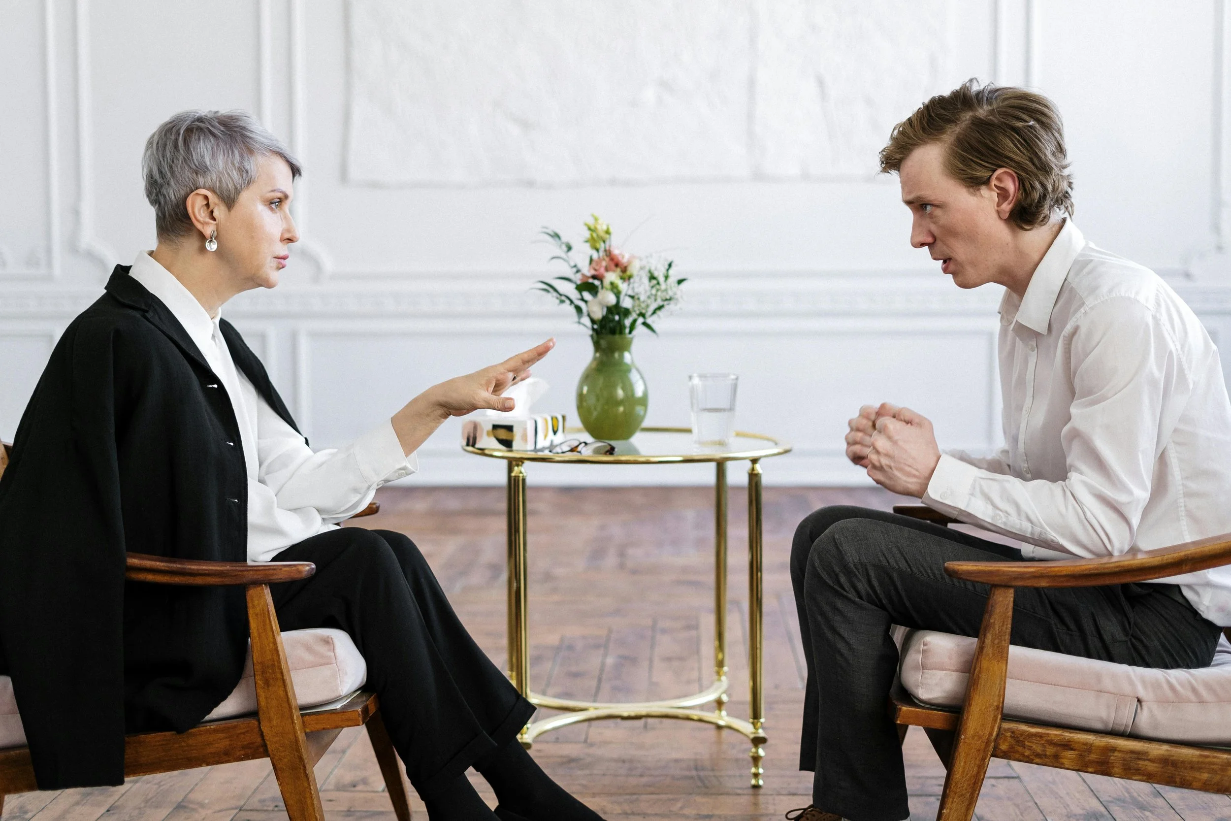

THE PURPOSEDr. Jane Valetchikov helps diverse young professionals who desire to shift habits and find clarity in outside and innerpersonal relationships.
The Strategy
The strategy for branding Jane Valetchikov was to create a grounded, supportive identity that feels like a safe space for growth rather than something clinical or distant like most therapy offices. Designed for diverse young professionals seeking clarity, the intention was to visually reflect Jane’s supportive ability to help clients work through patterns of avoidance through mindful techniques.
The brand is built around a sleek serif typeface with flowy ligatures that provide a sense of femininity and approachability without compromising professionalism or credibility. This allows the brand identity to feel both welcoming and grounded, reflecting Jane’s empathetic yet structured therapy approach. The color palette of slate grey and a soft blue was intentionally chosen to evoke trust, a calm nature, and kindness. All together, this creates a sense of safety and clarity, reinforcing the brand as a supportive space for growth and self-reflection.
CORE VALUES: support, education, transparency, growth
TRAITS: educated, credible, refined, trustworthy